What The News Needs Is More History
How do we make sense of the present? By comparing it to the past. No past, no comparison, no making sense.
This space has been quiet for some time as an approaching book deadline has concentrated my mind’s labour much as a black hole concentrates light. I do intend to get back here — I have big plans — but that will have to wait.
In the meantime, I need to vent a little steam at the news media.
No, I will not complain that The New York Times is blatantly biased against what I passionately support. That’s temptingly fashionable, but, no.
My complaint is how the news routinely fails to make sense of the present by providing historical context.
By “historical context,” I don’t mean lengthy essays (“thumb-suckers,” in journalistic parlance) explaining how we got to now. I mean something so much simpler. In fact, it’s dead easy. Any news organization can do what I propose with only trivial effort. It’s interesting. Even entertaining. Readers would thank whoever did it.
Consider this entirely typical news item from a couple of weeks ago: “New jobs report again shows weaker-than-expected job growth. The US unemployment rate edges up to 4.2%.”
That’s the meat, potatoes, and veg of daily news.
But a good editor will recognize that as routine as a story like that is, the average reader does not keep a running mental tally of unemployment rates. To make sense of it, it needs to be put in context.
How should that be done? In almost every case, the report will note that the unemployment rate rose from (just making up numbers here) 4.0%. And nothing else.
Now, what is the average person to make of the news that unemployment rose from 4.0% to 4.2%? Unemployment is bad, so more unemployment is bad. But there’s no other way to get a grip on the meaning of this news. Something bad is happening. That’s it.
The solution is as obvious as it is simple: Tell us what the unemployment rate has been in the recent past.
Same for crime numbers. Terrorist attacks. Air crashes. And a thousand other stories with readily available data. Give it at least some historical context by showing us the numbers.
Simple, right?
And yet, it’s seldom done. I have no idea why not. I worked for a newspaper for a decade and a half. I constantly badgered people about running simple graphs of basic historical context and got nowhere for reasons I didn’t understand then and still don’t today. This stuff should be so easy.
But then there’s The New York Times. The gold standard of journalism. Surely, it must do better?
It often does. And it did on that jobs story.
When the news broke, the Times ran the following graph:
That is useful information. Unfortunately, it is also very misleading.
Note the start-point. What you are seeing on the left hand of that graph are extremely unusual numbers of new jobs. That’s because the Covid pandemic crushed employment in 2020. Jobs that were swept away in 2020 came back at a furious pace through 2021. Inevitably, that torrid pace of job growth slowly diminished and the labour market returned to numbers that were still good but not spectacular. And it continues to decline.
But what would a reader who doesn’t know all that context see when she looks at that chart? Steadily declining job creation over the Biden years. It’s all downhill. And now? Pitiful numbers.
Conclusion? Everything’s gone to hell in a hand basket.
And that’s only the lesser problem with The Times’ chart. The greater problem is the depth of the historical context The Times provides.
Three years? Given the length of business cycles, that’s extremely shallow. I can only surmise they chose that 2021 start because that’s when the administration changed. They certainly didn’t think, “does this provide the best context for readers trying to understand what the latest number means?” If they had, they would have scrapped that.
Instead, they would have chosen a chart that spans business cycles and administrations, so people could do some serious comparisons.
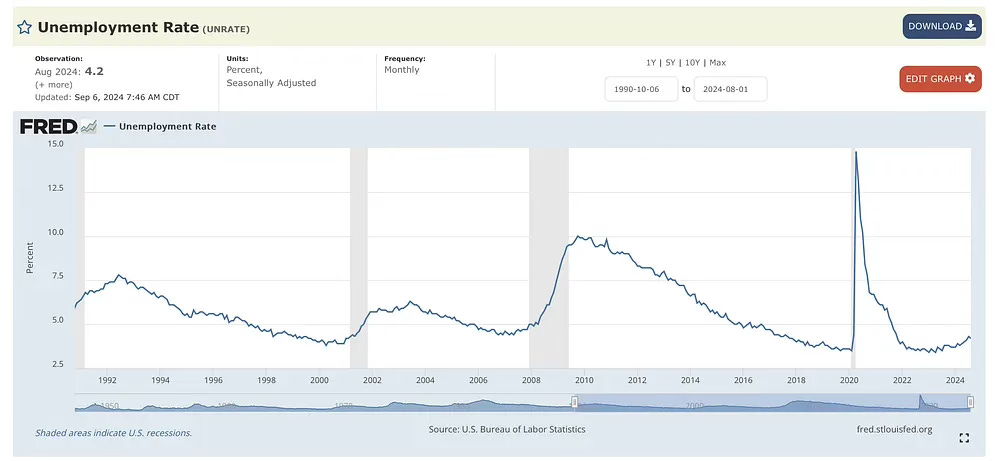
And they would have chosen something like this chart of the unemployment rate:
I will leave it to you to decide what thoughts that chart inspires.
The point is, it does inspire thoughts, doesn’t it? Whether you are a Republican or a Democrat. Whether you think the current economic climate is weak or strong. That chart is just full of interesting perspectives. It is so interesting! (For me: “The current unemployment rate is about the same as it was during the golden years of the late 1990s? Wow! And look at that smooth curve from 2010 to today — as if who’s in the White House matters less to the macroeconomic picture than people think it does.”)
Was it terribly laborious to come up with that chart? It took me about 30 seconds to find the website, select my parameters, and start perusing my chart.
Of course a news organization could fancy it up. Shade in the administrations and label them “Biden,” “Trump,” “Obama” and so on. As a reader, would you want more information presented this way? Of course you would. And given current tools, making better charts than my lame attempt would take a skilled person, what? Five minutes to make? Ten?
So why don’t they do more of that? In all sorts of stories? In fact, why isn’t it standard operating procedure that any time a big story is published, the basic underlying historical data must be presented to put the story in context?
Again, I don’t know the answer to that question. I really don’t get it.
But if I had to bet money, I’d say it’s a manifestation of a relentless temporal bias that afflicts so many people who work in daily news: As an old journalistic aphorism has it, “three-quarters of news is ‘new,’” so journalists become obsessed with novelty. What just happened? What’s next? That’s all that matters. The past is old and boring and no one cares and … BREAKING NEWS!!!
Now, before I take my meds and stop shouting at clouds, let me conclude with one more complaint.
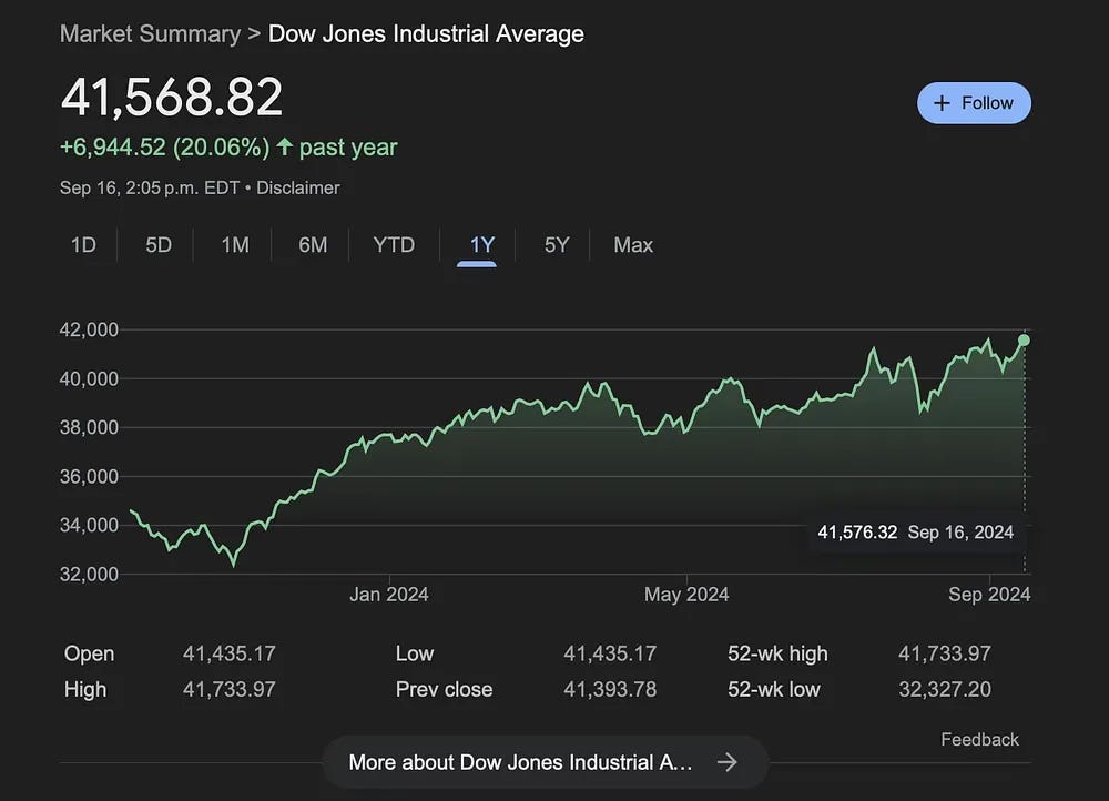
Take a look at the graph below, which shows the level of the Dow this year.
Each steep drop on that line prompted a wave of “stocks plunge!” headlines on the front pages of newspapers and commentaries about how things could get so much worse. But the rises that followed them? Few or no headlines. Few or no commentaries.
One of the iron rules about news — not just as a business, but as something people share with others — is that while something suddenly getting worse is urgent news we feel compelled to hear and pass on, something gradually improving doesn't feel like news at all. Psychologically, this makes sense. But still, it means the news is inherently biased in favour of the negative and against the positive, and therefore provides a consistently distorted picture of reality.
If you are an ordinary reader of the news, but you don’t follow financial news, you would have good reason to think that, at best, stock markets have been rocky over the past year. I wouldn’t blame you if you think they’re actually down substantially. That’s all you’ve read in the main news pages, after all.
But here is the S&P 500 over the past year.
Up almost 29%.
That’s an incredible year. It beats the rises in 1998 and 1999, during the legendary dot com boom.
Something like the chart above should be published in every significant story about stock markets, especially in the main news section. Until then, the news is deeply skewed.
As always, caveat lector.


Absolutely loved this read - thank you! I know you are pleading for a more recent sense of history, but as a historian of the much more distant past (I love CE dates with 3 digits), the same can, judiciously, be said for any historical perspective.
Seeing things in terms of 100- or 1000-year patterns doesn't mean I don't care about what is happening now but it helps to quiet the panic and identify the really big stuff (which often isn't headline-grabbing). As you rightly say, no comparison, no making sense!
Great article. Thanks.
Would be interested in your view on another angle to context in journalism. Take a complex issue that a journalist thinks is important for people to learn about. Seems unlikely that an article which opens with lots of stats and context will attract interest. So, the article will begin with an example story about an individual or a family. This does the trick and I am more likely to read and to be drawn in to learn more because there is emotion, risk at play. I can see myself in that situation and how I might feel. Hopefully, at this point additional context is provided that allows me to understand if this truly might affect me, my community or my country.
Unfortunately, very often we are presented with an issue, risk or problem only or primarily from that emotional perspective. Multiple individual narratives might be provided, all of which are emotional and seem risky and scary to me. I am drawn to think that my family is also at great risk. This is especially the case if the potential consequences are serious and significant. And this is easy to conclude as I have just read about or watched a person devastated in a hospital bed or gutted by the loss of a loved one. For a recent example, I am thinking about multiple stories on the national news about equine encephalitis. The death of a baby from this disease was tragic but it took a long time to learn it was one of 8 (I think) cases in Canada.
Or a couple of years back a week long series about sexual predators within the youth sports world. Each incident cited presented a debilitating situation for the individuals and families concerned. And numbers provided seemed large - hundreds of coaches convicted of sex offences against their athletes. Reports eventually made it clear that this was over a 20 year period but nowhere did it indicate over how many coaches overall. Hundreds of such cases are devastating in each case but does not help me decide whether the risk to my children in sport is so great that I should consider not registering them.
This journalistic method may draw my attention but its focus on emotion (and negativity as you point out), leaves too many people believing that they and theirs are directly at risk of many things where they are massively unlikely to be affected. And this is a standard part of commentary on social media where a single lurid incident is used to generalize a problem or a person’s position/argument. Which then also seems to justify ‘solving’ a complex problem with one preferred answer.